Neutral Paint Colors | My Home Paint Colors
As an interior designer, I’m excited to share my favorite tried-and-true neutral paint color. These are the beautiful shades we’ve personally used throughout our home.
One of the questions I’m asked most often is, “What paint color did you use in [insert room]?” To make things easier, I’ve created a comprehensive guide that includes all the paint colors we’ve used throughout our home.
As someone who gravitates toward timeless neutrals and has selected thousands of paint colors for clients over the years, I’m confident these are some of the best neutral shades available. If you’re searching for that perfect neutral paint color, this guide is a great place to start.
The Best Neutral Paint Colors
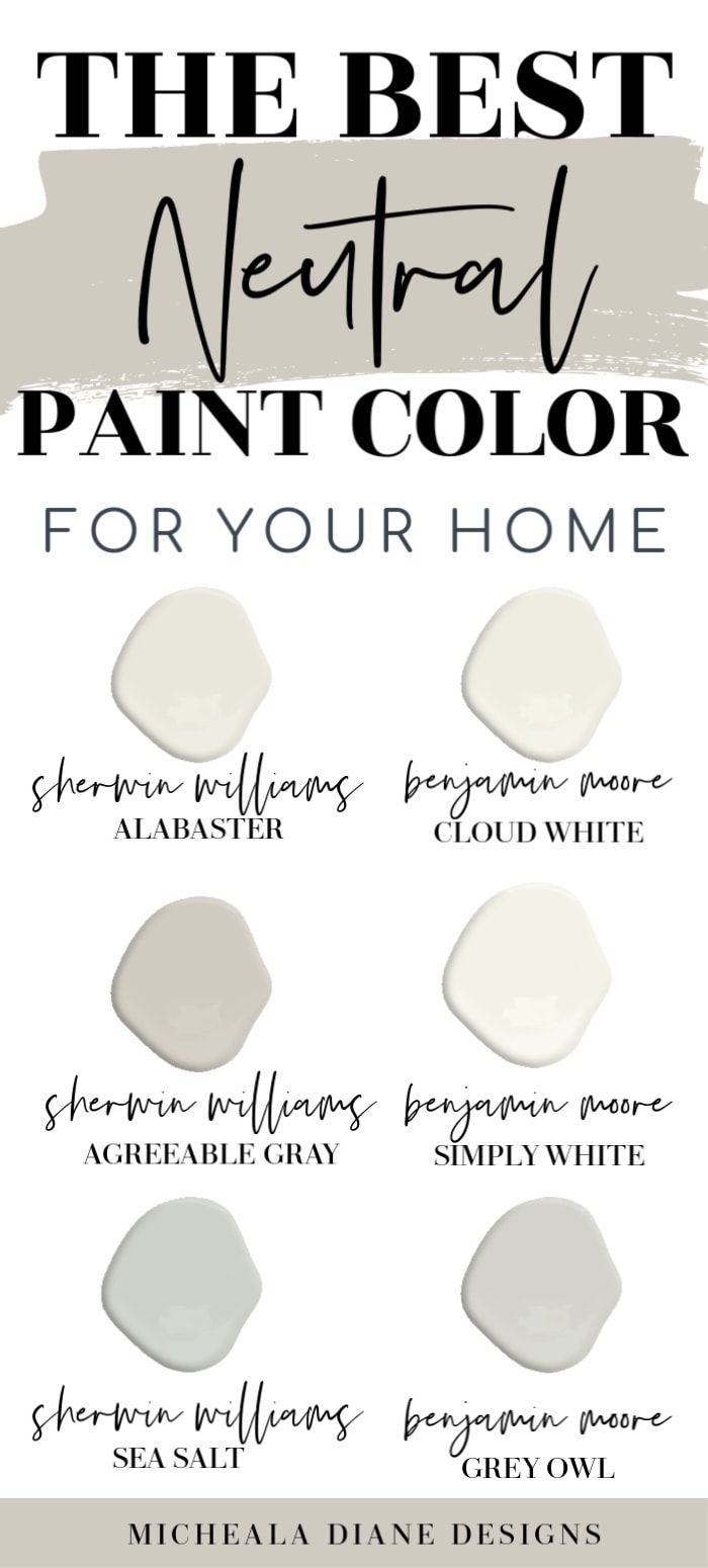
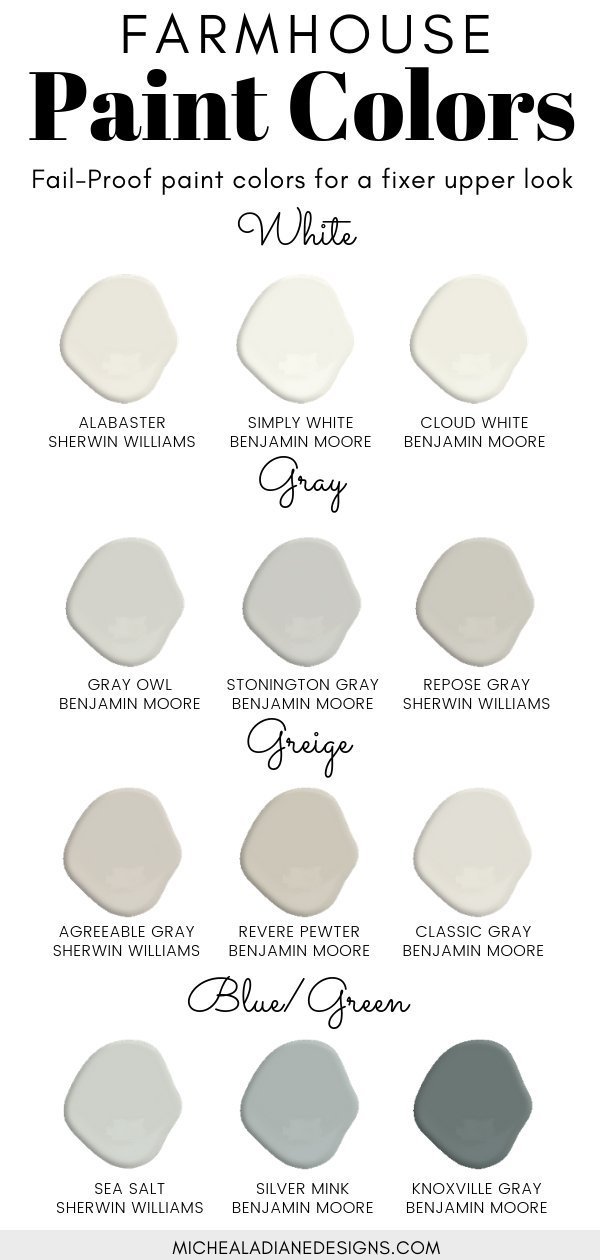
1. Sherwin Williams Alabaster
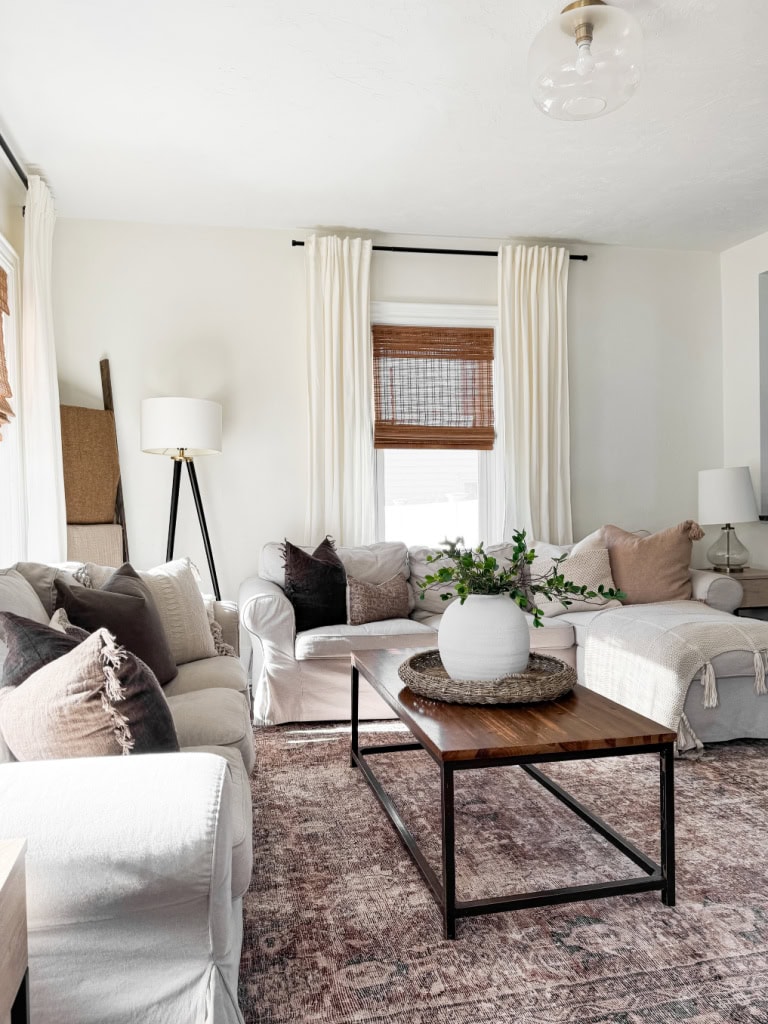
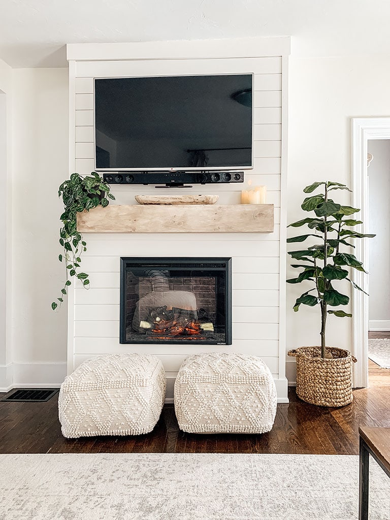
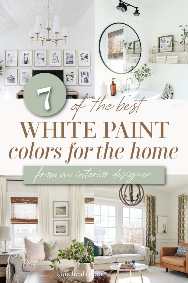
This is hands-down my all-time favorite white paint color—and the one I recommend most often to clients searching for the perfect white. It’s a creamy, balanced shade that never reads yellow, striking just the right harmony between warm and cool tones. It’s lovely on shiplap; in fact, we used it in our living room and again on our DIY shiplap fireplace. The result is a cozy, inviting white that complements any style of decor effortlessly.
Sample this paint color: Sherwin-Williams Alabaster SW7008
2. Sherwin Williams Agreeable Gray
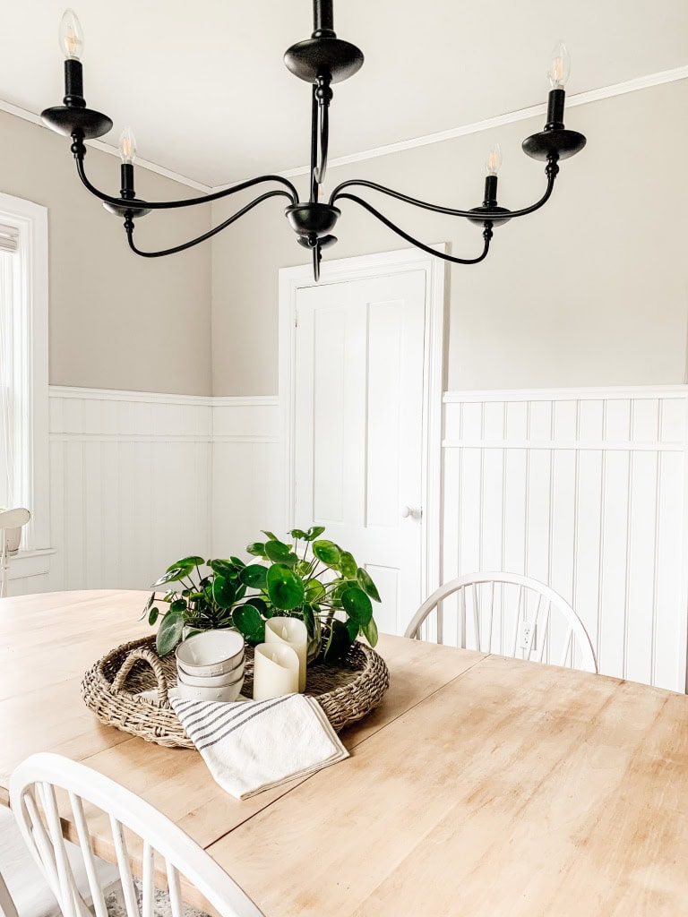
Next up is Agreeable Gray—a timeless favorite we used in our dining room above the beadboard. This versatile shade strikes the perfect balance between gray and beige, offering just the right mix of warm and cool undertones. Its adaptability makes it nearly foolproof, working beautifully in almost any space. If you’re trying to coordinate with existing decor or simply want a neutral that won’t clash, Agreeable Gray is always a safe and stylish choice.
sample this paint color: Sherwin-Williams Agreeable Gray SW7029
3. Benjamin Moore Cloud White
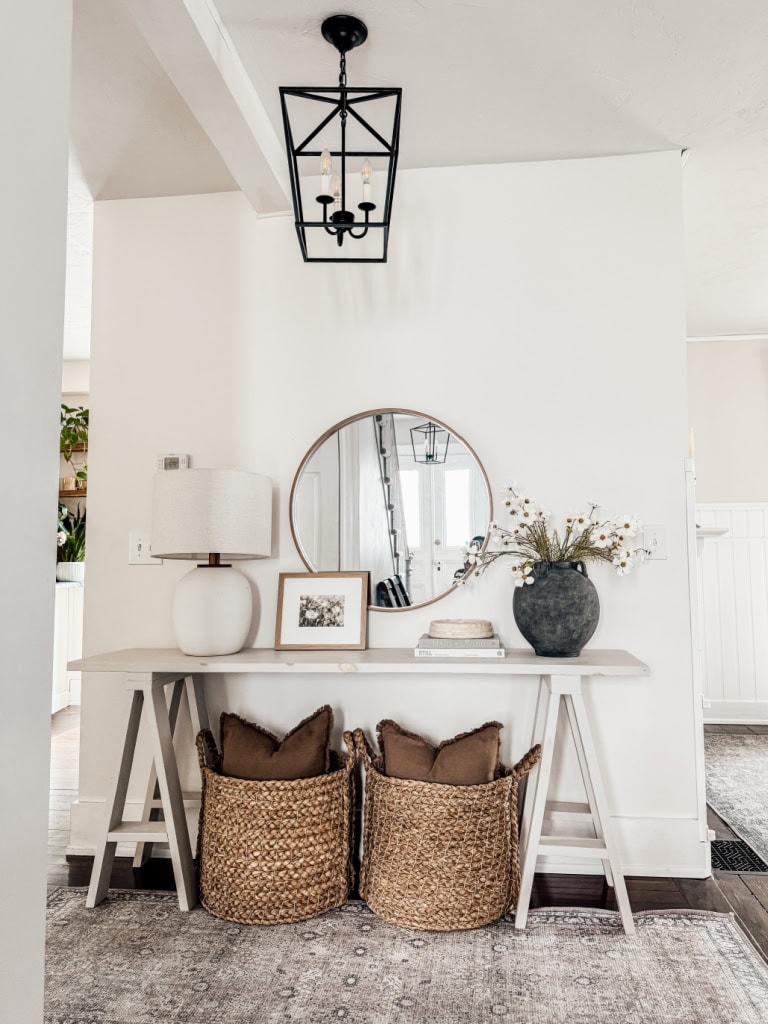
We used Cloud White in our entryway, and it’s quickly become one of my go-to soft whites. With its neutral undertones, it offers a warm, welcoming feel without leaning too yellow or too blue. It pairs beautifully with bright white trim, creating just the right amount of contrast while still feeling cohesive. Cloud White is a versatile choice that works well on walls, trim, and even ceilings, perfect for creating a light, airy entry that sets the tone for the rest of your home.
sample this paint color: Benjamin Moore Cloud White OC-130
4. Benjamin Moore Grey Owl
Our primary bedroom is painted Grey Owl—lightened by 50%, and it’s truly one of my all-time favorite gray paint colors. It’s a soft, airy gray with a modern feel that creates a calm, restful atmosphere, perfect for a bedroom retreat. While Grey Owl naturally leans cool and can show subtle green or blue undertones depending on the lighting, lightening it by 50% softens those tones and brings out a more neutral, balanced look. It’s a beautiful, versatile choice if you’re looking for a serene and timeless gray.
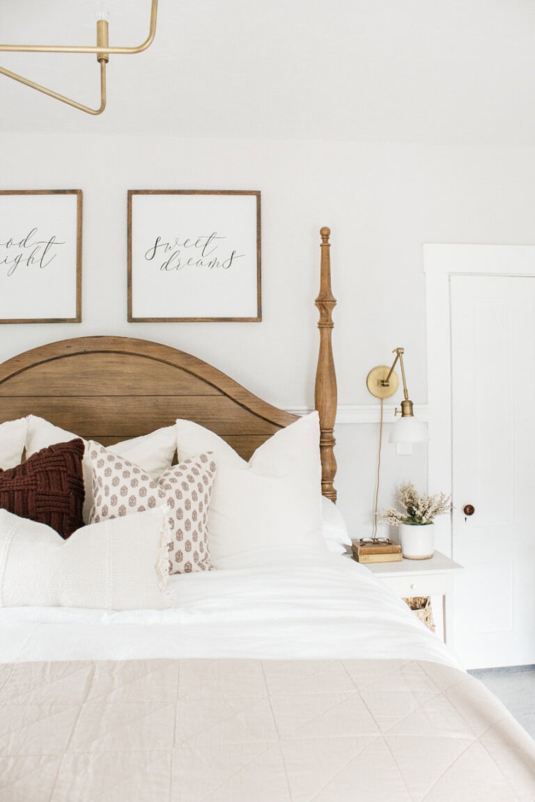
sample this paint color: Benjamin Moore Grey Owl 2137-60
5. Benjamin Moore Simply White
Simply White is one of the most versatile and timeless whites out there. It’s a clean, pure white with just a touch of warmth—enough to keep it from feeling stark, which is exactly what makes it so popular. We used it on both the walls and shiplap in our bathroom, and it gave the space a fresh, bright, and inviting feel. If you’re struggling to choose a neutral white, Simply White is a nearly foolproof option that works beautifully in any room.

Get this paint color: Benjamin Moore Simply White 2143-70
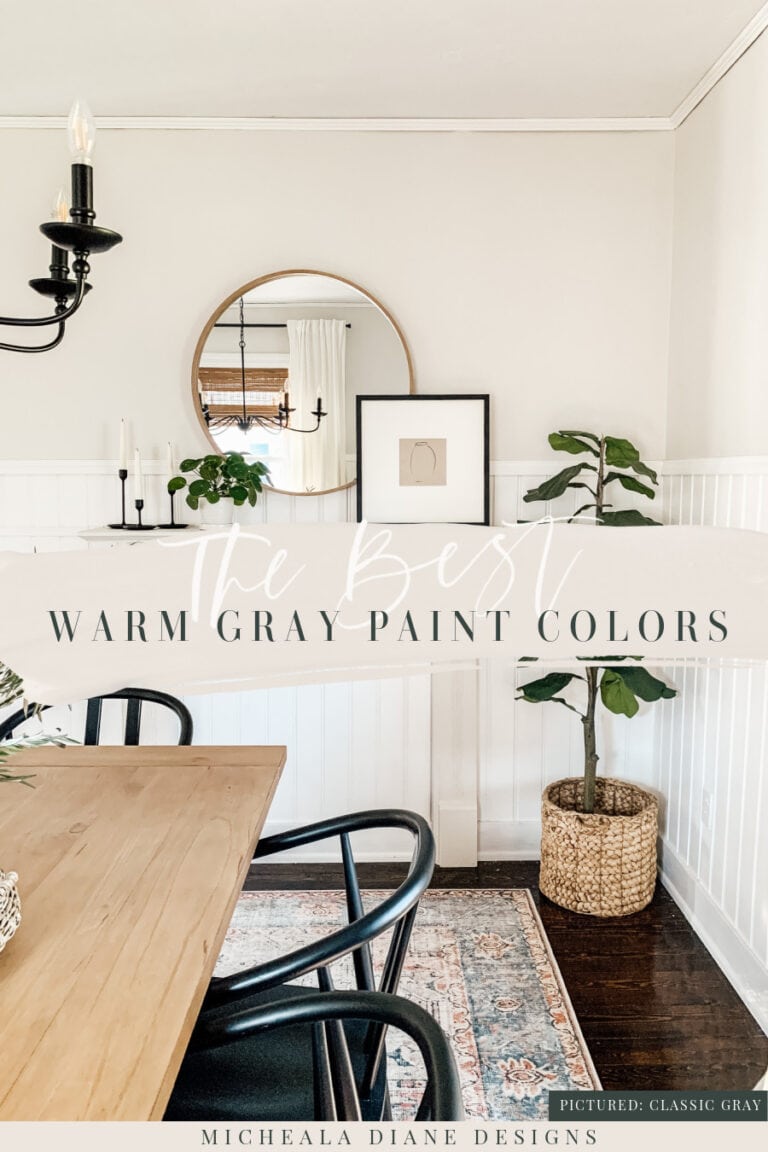
6. Benjamin Moore Classic Gray
We used Classic Gray in both our dining room and playroom, and it’s one of those colors that just works effortlessly in any space. It’s a soft, light gray with warm undertones that give it a subtle, almost creamy feel, making it a perfect backdrop for both formal and casual rooms. Classic Gray is elegant, understated, and incredibly versatile, which is why it’s one of my go-to neutrals for creating a calm and cohesive look throughout the home.
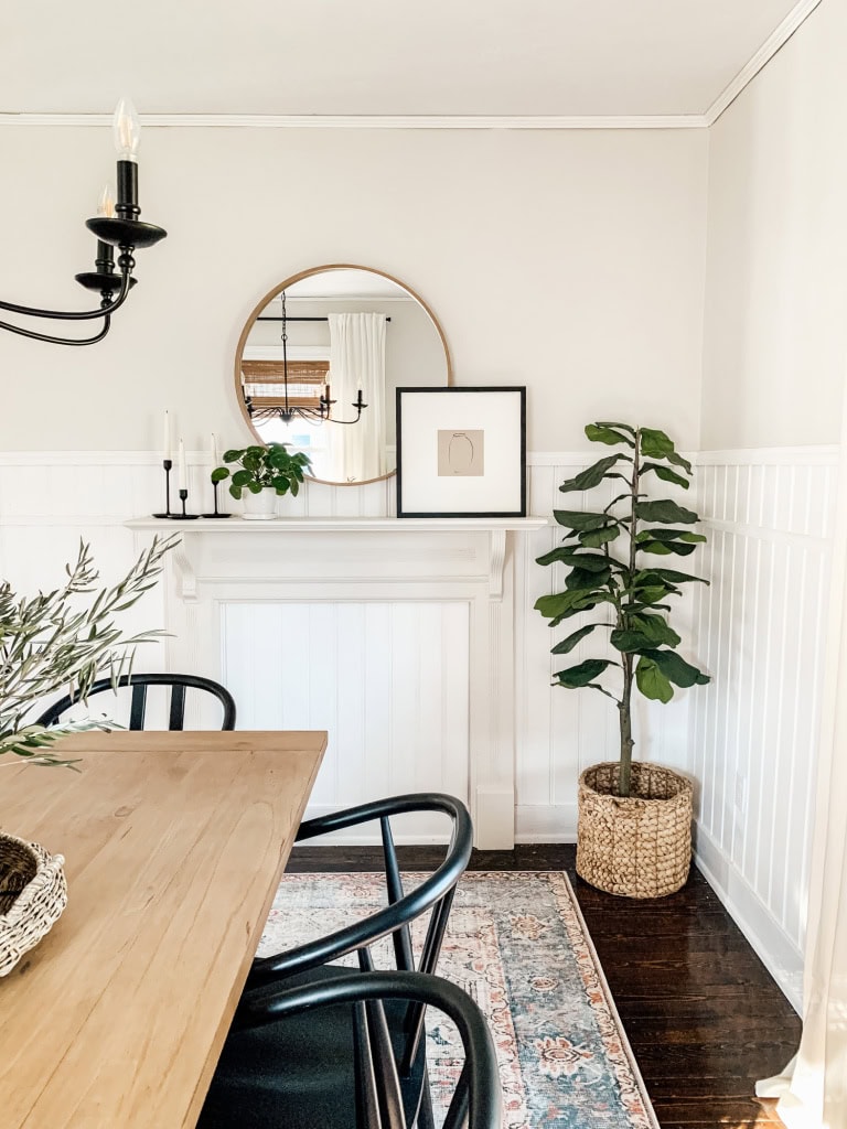
Get this paint color: Benjamin Moore Classic gray
7. Benjamin Moore White Dove
Benjamin Moore White Dove is a soft, warm white with gentle creamy undertones that give it a subtle warmth without feeling yellow or heavy. It’s bright and clean but has enough depth to avoid looking stark or cold, making it incredibly inviting and versatile. This color works beautifully in a variety of lighting conditions, adapting easily from natural daylight to softer indoor light, creating a calm, airy, and timeless backdrop for any room.
Get this paint color: Benjamin Moore White dove
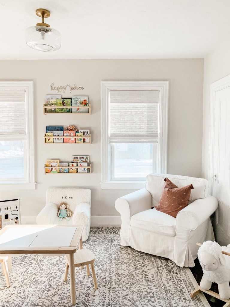
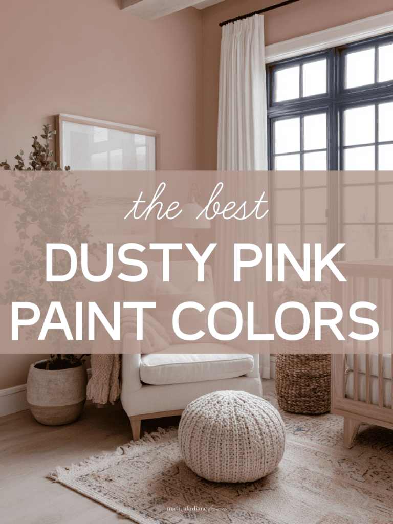
8. Magnolia Home Yarn
Magnolia Home Yarn is a soft, muted neutral with warm beige and gray undertones that create a cozy, calming atmosphere. Its subtle warmth adds depth without feeling overpowering, making it a perfect choice for nurseries and other restful spaces.
In our nursery, we painted the lower half of the walls with Yarn to introduce a gentle contrast and grounding element, while keeping the overall look soothing and inviting. This color pairs beautifully with lighter tones above and adds just the right amount of warmth to make the space feel nurturing.
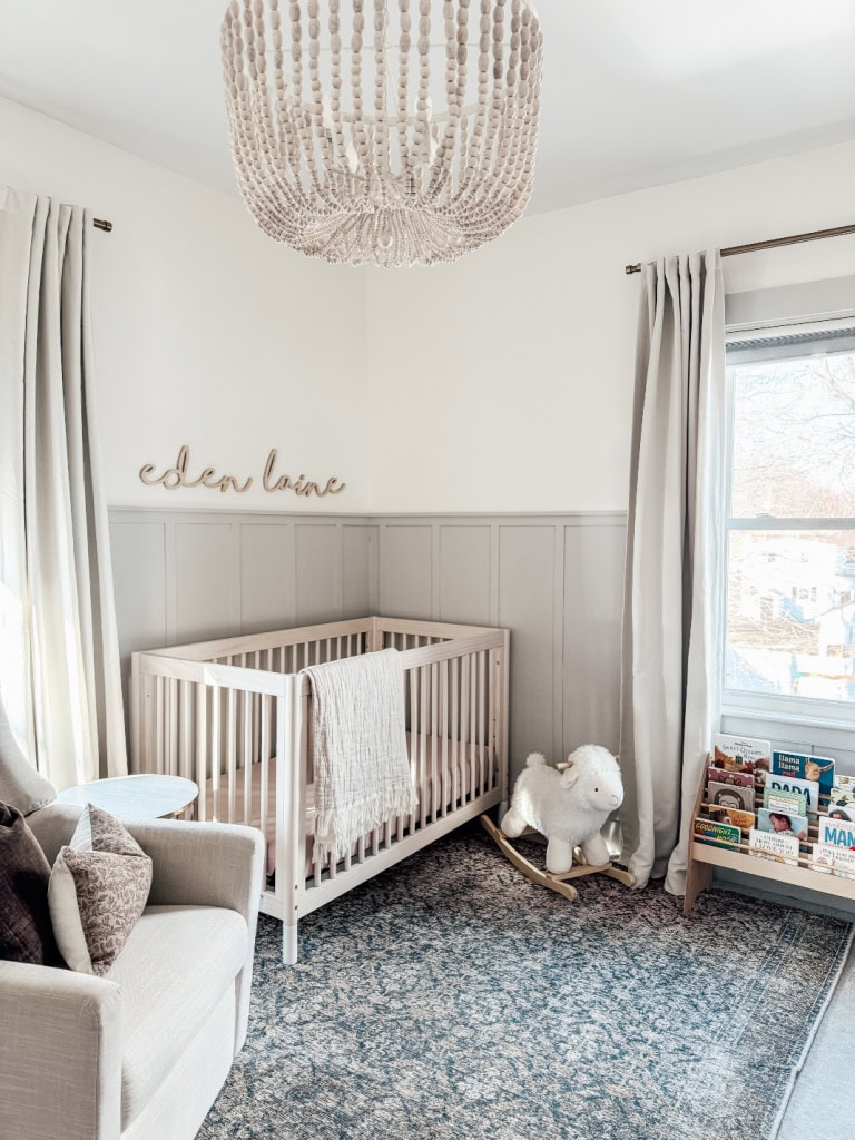
Get this paint color: magnolia home yarn
9. Benjamin Moore Revere Pewter
Benjamin Moore Revere Pewter is a sophisticated, warm gray with subtle beige undertones that give it a soft, timeless appeal. It strikes the perfect balance between light and medium tones, making it incredibly versatile and elegant without feeling too dark or heavy.
In our office, we chose Revere Pewter for the desk cabinetry to create a grounded yet inviting workspace. Its warm undertones complement a variety of decor styles while adding depth and character to the built-ins. This color brings a sense of calm and professionalism, making it an ideal backdrop for productivity and focus.
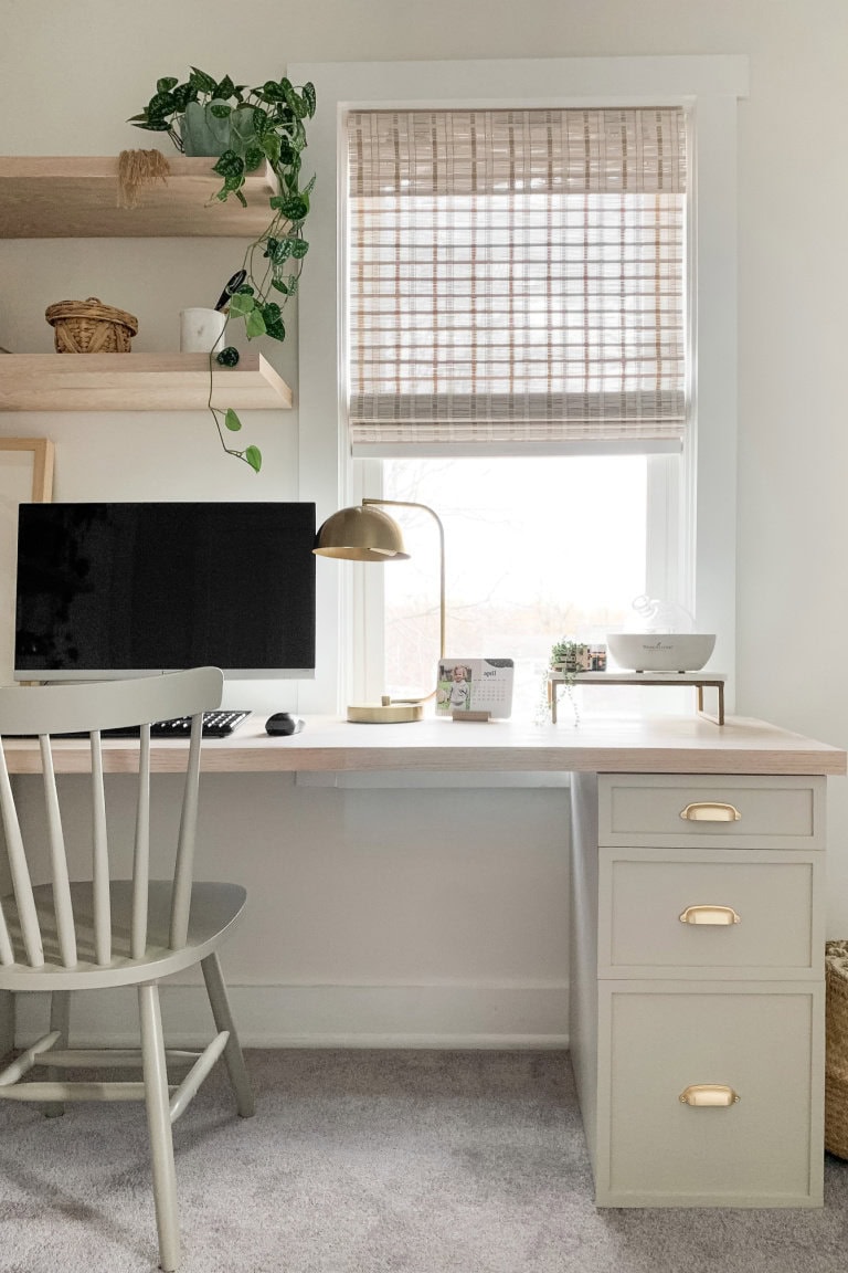
Get this paint color: Benjamin Moore Revere Pewter
10. Sherwin Williams Sea Salt
When you think of neutrals, bold color might not come to mind, but muted tones with just a hint of color can make the perfect neutral backdrop. Sea Salt by Sherwin-Williams is one of those beautiful, chameleon-like shades. We used it in our den, and it completely transformed the space with its soft, serene feel. Sea Salt has subtle blue-green undertones balanced by a touch of gray, which allows it to shift beautifully with the light, sometimes appearing more blue or green, and other times leaning toward a soft gray. It’s a calming, fresh choice that still feels neutral and versatile.
sample this paint color: Sherwin-Williams Sea Salt SW6204
If you are looking for the perfect rug to go with this color, this vintage one is the best!
Trim Color
All the trim in our home is Glidden Satin Pure White GLN6211N.
Peel, Stick, Decide: How I Sample Paint Without the Mess
Before committing to a full gallon of paint, I always recommend testing samples directly on your walls. The same color can look dramatically different depending on the lighting, time of day, and surrounding finishes in your home.
One of my favorite tools for this is Samplize—an online retailer that offers peel-and-stick paint samples made with real paint. These samples make it easy to test colors without the mess or commitment. You can move them from wall to wall to see how the color shifts in different lighting, all without damaging your surfaces or dealing with leftover paint cans.
I hope you found this paint color guide helpful! I’ll continue updating it as we paint more rooms in our home, so be sure to check back often for new additions and inspiration
What to Read Next:
Want to save this for later? Post these Neutral Paint Colors to your favorite Pinterest Board!


Hi there. I’m painting my master bedroom and can’t decide between BM simply white, SW Alabaster, or BM white dove…I’m going for a fixer upper Joanna Gaines look btw. Any suggestions? I’ve even considered BM cloud white but seems super white.
They are all great whites, Alabaster is my favorite but I recommend sampling them all in your space. Based on the light in your room come may read more yellow or blue.
Thank you ! I went with Alabaster after sampling so many on my walls lol! Based on my samples I liked how it’s still white and bright but warm and cozy at the same time. About to finish painting today and am hoping I like it once it’s all on the wall😊.
My downstairs is pretty open concept, except for the oversized dining area. I painted my kitchen and living room Alabaster (it’s flows as one large space) and my dining room Agreeable Grey. I’m having my entry way and foyer painted next and was curious what you thought would be a good color. I would like to keep it light and bright to flow with the downstairs. I was thinking keep Alabaster throughout the foyer and leading into open kitchen/living, but curious on your thoughts?
I think you could keep Alabaster or if you would like to go with a brighter white I have white cloud mixed in with all of those colors on my first floor.
Hi there, we are working on renovating an older home built in 1945. I am working on picking paint colors for the house and found your blog. I love your house and colors!! I have a couple questions. What white paint color are you using for your ceilings? My master bedroom and kitchen will have shiplap ceilings. Would you use the same white paint you used for the regular ceilings or change it because they are shiplap? And finally, for my master bedroom I am looking to use a bluish gray color. I am wanting to keep it neutral and use bedding similar to yours. My problem is that my furniture is cherry wood. Any paint color recommendations? I really liked the room you did with Sherwin Williams Sea Salt, but am questioning if that color will be okay with cherry furniture.
Hi Rachel! All of my ceilings are a pure white flat paint. You can find this in any brand. For your master bedroom I would love to work with you. I do offer paint consultations If you are interested you can reach out through the contact button on my blog or email me at [email protected].
We are building a classic/timeless farmhouse on 20 acres. We used Alabaster in our old house and loved it. But our builder is using Benjamin Moore paint and I am not sure what color is closest to Alabaster. What do you recommend? Also, what color do you recommend for kitchen cabinets/trim? We are probably going with painted white but are considering some stain, maybe stain the island. Help! Thanks
Hi Katie, Here is the post of my favorite whites https://michealadianedesigns.com/the-best-white-paint-colors/. I also offer paint consultation for a small fee. Feel free to email me.
Love this blog! So extremely helpful!! I’m curious, what paint color do you use for your kitchen cabinets and all your trim? I’m wanting to paint my walls Alabaster, but am curious if there’s a trim that is purer white to go with the Alabaster walls. In my kitchen I’m also playing around with using Agreeable Grey and then a white for the cabinets. Any thoughts? Thanks so much!:D
Oh my goodness, I just found your blog about the trim colors! You’re the BEST!
Hi Andrea! Thank you for the sweet comment. My kitchen cabinets came with the house they are a pure/bright white but I do not know the exact color. I think Agreeable Grey would look great with a pure white cabinets. All of our trim is Glidden Satin Pure White GLN6211N. The pure white paint looks good with the alabaster.
FOUND IT!!! Just needed to look a little further on your website! Alabaster! Thanks!
I just wanted to inquire about your trim… I have decided to go with Alabaster white on the lower level of out home. I’m just not sure what to do with the trim. Any thoughts or help?
Thank you so much!!
You can paint the trim Alabaster in semi-gloss or go with a bright white.
What is the paint color of your living room space? I love the neurtrals!
All my home paint colors are listed in the post.
Hi there! I love these paint color choices. We’re closing on a house in a few weeks with wood trim in the living and dining room, it took a little while for it to grow on me but I’m now deciding on a white paint color for the living room that won’t look too yellow next to the wood trim. Its more of a walnut color. What color white would you recommend on the walls? I was thinking Alabaster but wanted to get your opinion.
Thanks!!
Hi Kristen! Alabaster is a warmer white. I would recommend going with Simply White, but always get samples. I recommend using Sampalize. Best of luck!
Do you recommend satin finish for your walls?
Hi Tabitha! I typically do eggshell on my walls but you can also use satin. It is slightly glossier than eggshell and easier to wipe down but not as glossy as semi-gloss. Hope that helps.
We are building a farmhouse, and I decided on alabaster for cabinets and trim, because it goes well with the granite we chose. We have not painted yet. Is this a mistake for trim? Seems like most are using it for wall color and going with brighter whiter white for trim and cabinets.
If you are doing the cabinets Alabaster I would also do the trim the same.
I want to paint the interior of our home white…but I have found that most whites have a yellow
Tint to them…except chantilly lace by Benjamin moore, I am not a fan of yellow…but am wondering if chantilly lace is to bright white for walls….what are your thoughts…thank you!
Chantilly lace is a great option for walls.
I am looking at putting shiplap in our half bath on one wall and paint it Alabaster. Would you recommend painting all the walls alabaster or a different color? And what about the trim?
Thank you!
Hi Jamie! If you want the bathroom to be white I would paint all the walls the same color, but you could always have the shiplap be a feature and choose another color for the other walls. I would keep the trim white.
I’m painting a small bathroom with moderate light and I’d like to use Sea Salt but the sample I tried isn’t as soft as I’ve seen here. At what percentage would you suggest I use so it’s there but not so saturated?
I always start at 50%
You have two shades in the bathroom, one above the rail and one below, can you tell me what those two are?
I’m sorry bedroom, not bathroom
They are both the same color 🙂
I am doing white/gray marble tile on the floor and shower. Would Alabaster look good on the walls/ shiplap walls? Also what color for the vanity?
Hi Kayla I offer paint consultations and would be happy to help you select paint for your project. Here is a link to my services: https://michealadianedesigns.com/services/
What color are the kitchen cabinets?
Hi Beth! The cabinets were painted when we moved in, so I do not have an exact color, they are however a pure white.
Hi could you help me? We bought a house where we are renovating throughout, the house has open concept and the kitchen cabinets is white, I like cozy décor all clear with white furniture and shades of wood and gold, do you think the color alabaster would look good? And I do not like to paint the other rooms of other colors I can paint the whole house the same color?
Hi! Check out my design services page. I would love to work with you. https://michealadianedesigns.com/services/
I resolved want to paint my office in sea salt and I absolutely love the vintage rug you have . Can you please tell me where you got it! Thanks for your help!
Here is the link: https://rstyle.me/+CiB-9UVOn9sdsKCbvsSWGw
I loveee all of these colors! Netural is the way to go! I recently bought a new home and am in the process of remodeling it. I would like to use Agreeable Gray on the walls throughout the whole house and Alabaster for the kitchen cabinet, but do you think that is too neutral and matchy? I guess I could add some contrasting color with decor, wall art, etc…
I think that would look great.
I painted my dining room in sea salt and I’m trying to find the exact color of curtains as you have. Can you please share the source?
Hi Mindy! They are DIY drop cloth curtains. Here is the tutorial : https://michealadianedesigns.com/diy-drop-cloth-curtains/
I have a shiplap fireplace and two alcoves surrounding it. Currently the alcoves are agreeable gray and the shiplap fireplace is sw pure white. Do you think if I change the shiplap fireplace to alabaster it would work with agreeable gray? thank you!