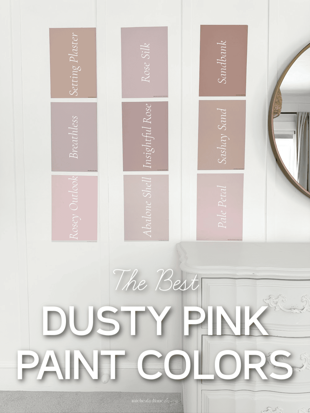
Dusty Pink Paint Colors
If you’ve been searching for the perfect dusty pink paint colors, this designer-approved guide breaks down the most beautiful shades.
Dusty pink paint colors have quietly become one of the most versatile and sophisticated choices in modern interiors. Recently, I’ve found myself especially drawn to them as I’m on the hunt for the perfect dusty pink for my daughter’s room. Far from the bubblegum tones of the past, today’s dusty pinks are softened with beige, taupe, peach, and even subtle gray undertones. Allowing them to function almost like a neutral.
In this post, we’re breaking down some of the most beautiful dusty pink paint colors, from Sherwin-Williams, Benjamin Moore, and Farrow & Ball. So you can confidently choose the right shade for your home. You’ll discover undertones, lighting tips, and what makes each color unique, helping you find the perfect dusty pink shade.
“ Affiliate links provided for your convenience, please read my disclosure for more information.”
Don’t Paint a Wall Until You Try This…..
As an interior designer, I can’t tell you how many times I’ve seen the wrong paint color completely change a space and not in a good way. Paint looks wildly different depending on lighting, flooring, furniture, and even what direction your windows face. That’s why I always recommend sampling before committing… and Samplize makes that process so easy.
Instead of buying messy sample cans (that you’ll probably never use again), Samplize sends peel-and-stick paint samples made with real paint in the exact color you’re considering. You can move them around your room, test them on different walls, and see how the color shifts from morning to evening. It’s such a game-changer.
I especially love this for my clients and, honestly, for myself when I’m hunting for the perfect shade. It takes the guesswork out and helps you feel confident before you invest time and money in painting an entire room.
If you’re choosing paint, please don’t skip this step. Sampling in your own space is everything. Samplize just makes it simple, clean, and stress-free, which is exactly how decorating should feel.
All the pictures of paint featured in the post are samples from Samplize.
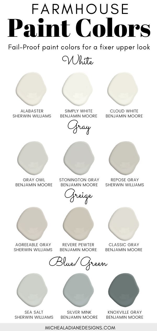
The Best Dusty Pink Paint Colors
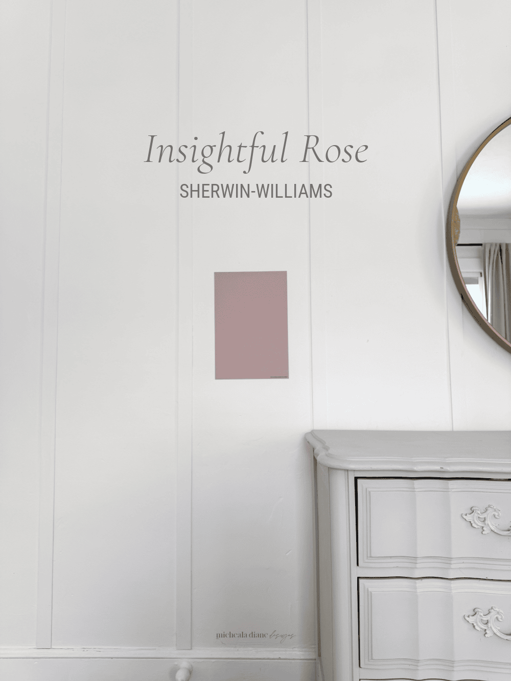
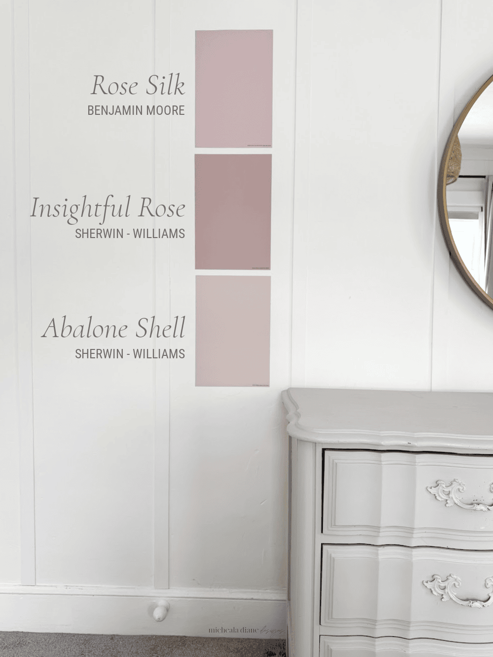
Insightful Rose Sherwin-Williams
Insightful Rose (SW 6023) is a refined, muted blush that reads more like a neutral than a traditional pink. It feels sophisticated, calming, and timeless rather than sweet or juvenile. It has undertones of beige, taupe, and subtle cool gray/purple tones, which prevent it from feeling overly sweet and more sophisticated.
With an LRV of about 46, it sits comfortably in the medium range, reflecting enough light to feel airy without washing out or looking pastel. In real rooms, Insightful Rose shifts throughout the day. Appearing lighter and slightly more pink in bright natural light. While becoming deeper, warmer, and cozier in lower light or evening conditions.
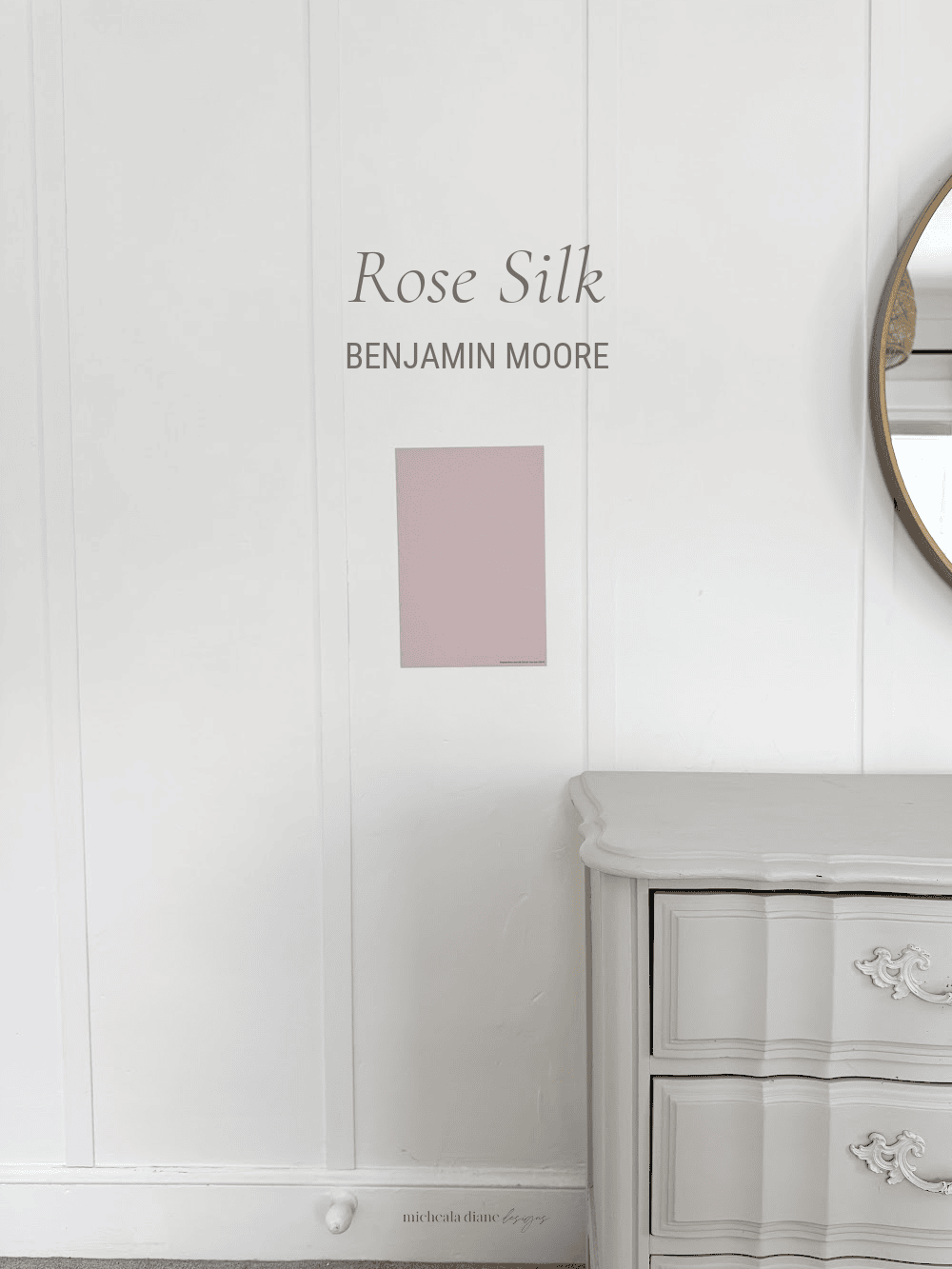
Rose Silk Benjamin Moore
Rose Silk (2104-60) is a soft, pale rose that feels airy, timeless, and not overly pink. Its undertones include muted rose, warm beige, and subtle mauve, with just enough softness to prevent it from feeling overly girly. The color’s warmth gives it a welcoming, flattering quality that works beautifully as a neutral alternative to beige or greige.
With an LRV of 57.56, it reflects a generous amount of light, making it a medium-light color that helps rooms feel open, bright, and calm. In real rooms, Rose Silk appears fresh in natural light. This color is often described as flattering in any light, making it very forgiving in a variety of exposures. What makes Rose Silk special is its balance; it adds warmth, personality, and subtle color without overwhelming the space.
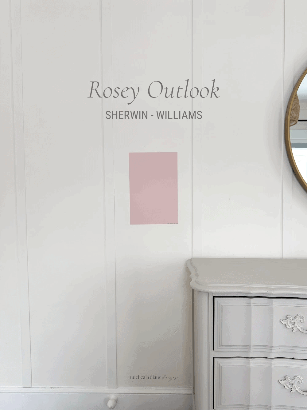
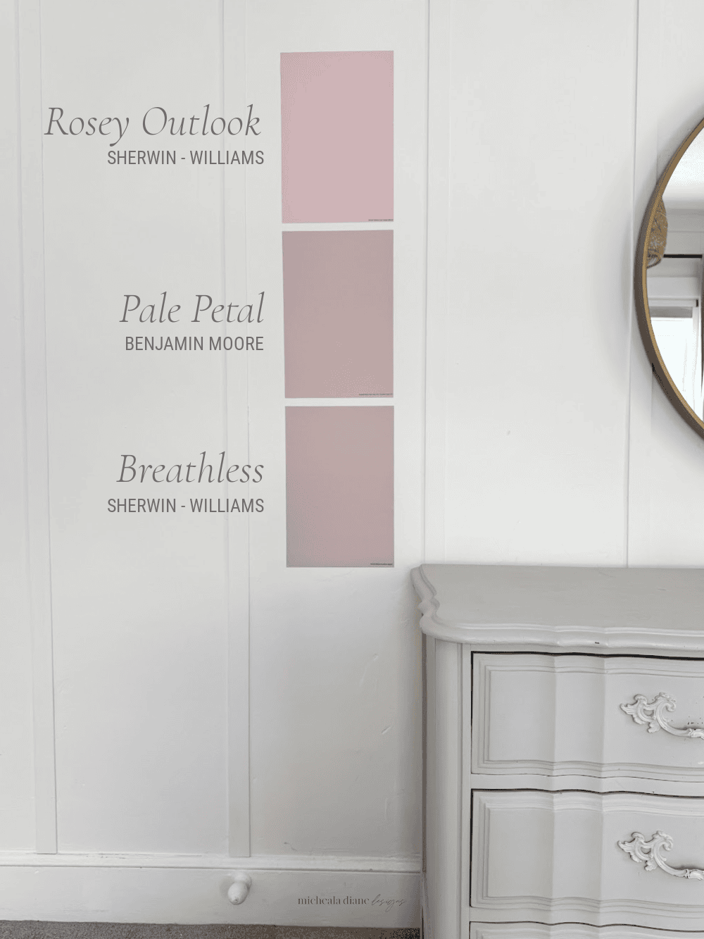
Rosey Outlook Sherwin-Williams
Rosy Outlook (SW 6316) is a soft, uplifting true blush that feels light and quietly cheerful. Its undertones lean warm pink with very subtle peach influences, which soften the color. This warmth makes it feel approachable and livable, allowing it to function almost like a neutral with a bit of personality.
With an LRV of about 66, it reflects a generous amount of light, helping spaces feel open, bright, and airy. Rosy Outlook appears fresh in strong natural light. Really showing its pink blush color, while in softer or evening light, it becomes warmer and cozier without turning muddy. Its balanced warmth helps it maintain a soft look throughout the day and across a variety of lighting conditions. What makes Rosy Outlook special is its ability to brighten a space while still feeling calm and sophisticated. It adds subtle color and warmth.
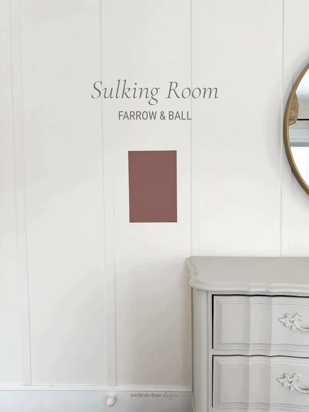
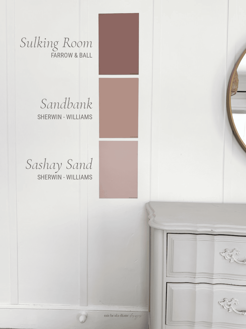
Sulking Room Farrow & Ball
Sulking Room Pink (No. 295) by Farrow & Ball is a deeply muted rose that feels earthy, romantic, and sophisticated rather than traditionally pink. Its undertones are complex, blending mauve, gray, brown, and subtle plum, which softens the pink. This makes it feel mature and timeless.
With an LRV of 20–25, it sits on the medium end of the scale, absorbing more light and creating a rich color. In real rooms, Sulking Room Pink shifts noticeably depending on the lighting. It can appear warmer and rosier in natural daylight, while becoming moodier and more muted with stronger plum influences in lower or artificial light. This chameleon-like behavior gives it depth and visual interest throughout the day.
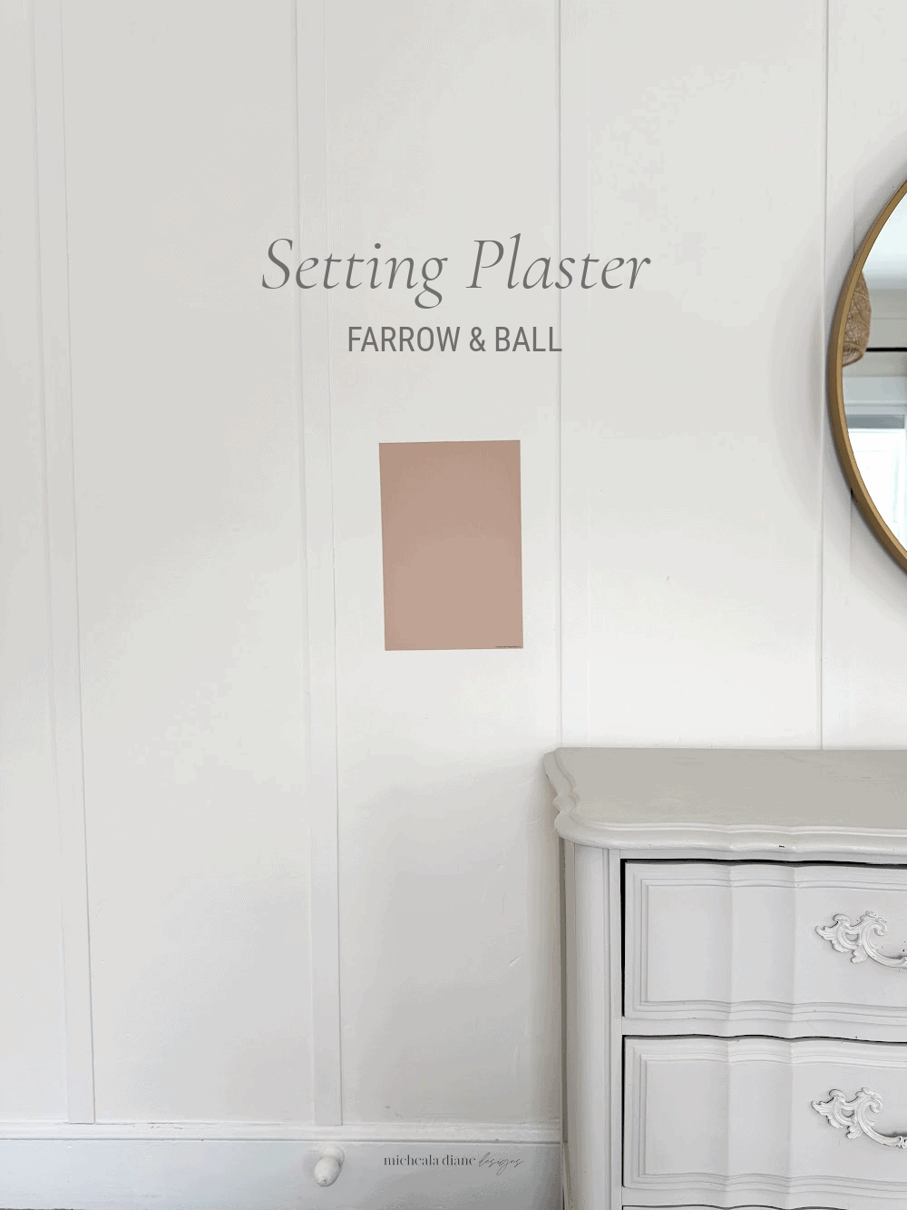
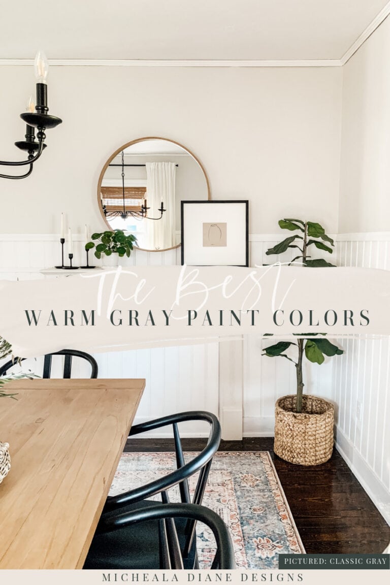
Setting Plaster Farrow & Ball
Setting Plaster (No. 231) by Farrow & Ball is a soft, dusty pink with a distinctly warm, sun-washed character. It feels timeless and architectural rather than overtly pink. Its undertones are balanced, combining blush, peach, and beige with subtle earthy brown influences. This grounds the color and gives it a sophisticated, historic plaster-like appearance.
With an LRV of 42, it falls into the medium range, reflecting enough light to feel warm and inviting while still providing depth and substance. In real rooms, Setting Plaster appears lighter and more peach-toned in bright natural light. While in lower or evening light, it deepens into a richer, warmer dusty rose. What makes it special is that it feels both classic and modern, adding warmth and softness to walls while remaining incredibly versatile.
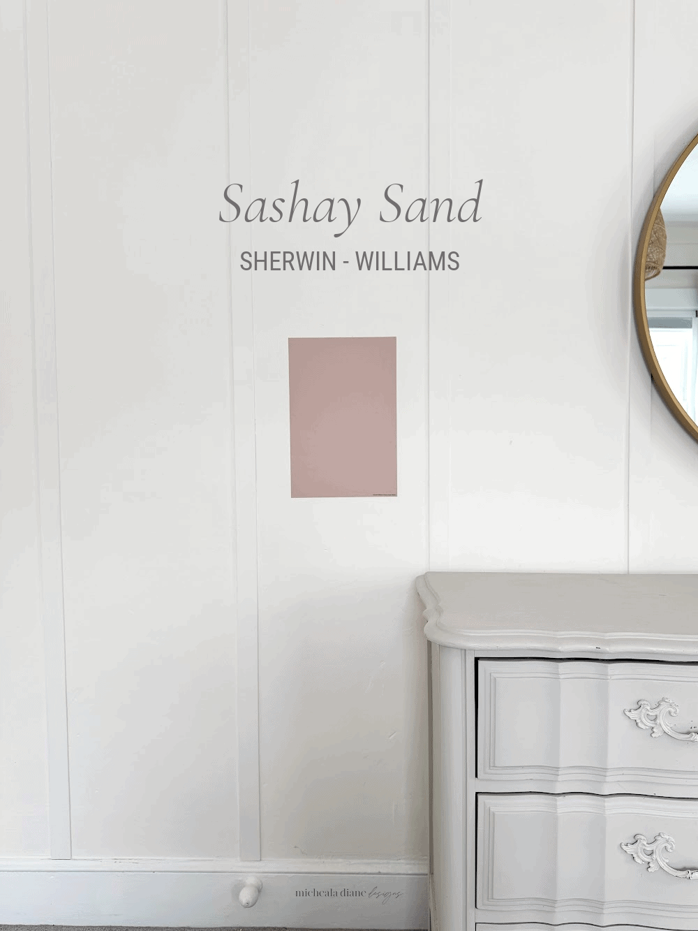
Sashay Sand Sherwin-Williams
Sashay Sand (SW 6051) is a soft, muted blush-beige that feels warm and subtle. Its undertones blend warm pink, beige, and slight peach, grounded by a gentle taupe influence that keeps it from feeling overly sweet or feminine.
With an LRV of 49, it sits almost perfectly in the middle of the light scale. This means it reflects about half the available light, giving it more depth and body than airy blush tones while still avoiding heaviness. In real rooms, Sashay Sand won’t feel washed out in natural light. While in lower or artificial lighting, it reads more like a warm beige with a subtle rosy glow.
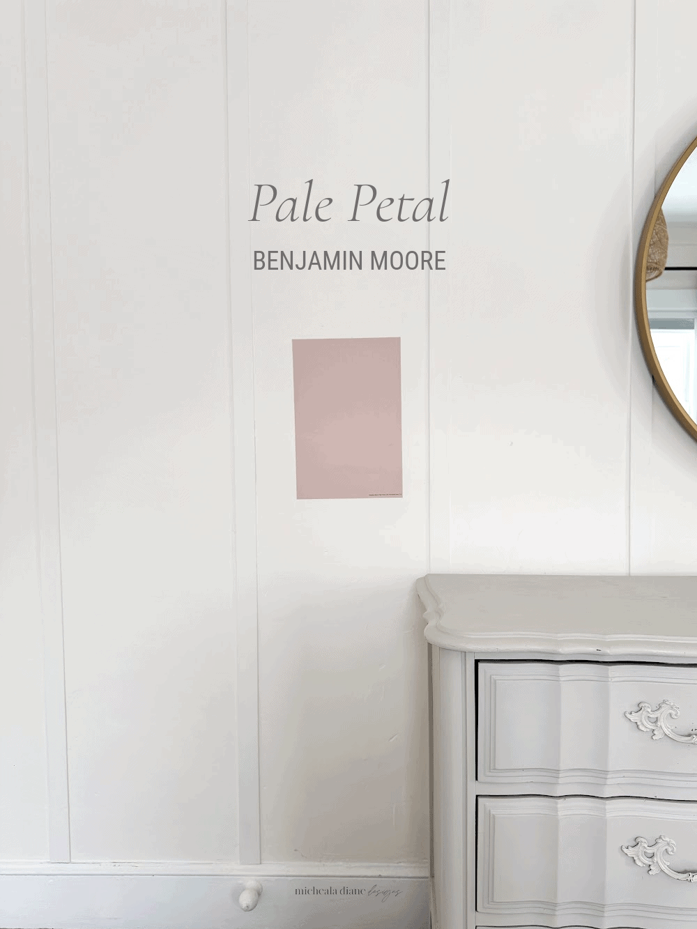
Pale Petal Benjamin Moore
Pale Petal (1178) by Benjamin Moore is a delicate, barely-there blush that feels soft and airy. Its undertones combine soft pink, warm beige, and subtle peach. The combination prevents it from feeling overly sweet or pastel.
With an LRV of about 57.42, it reflects a high amount of light, making it a light color that helps rooms feel bright. In real rooms, Pale Petal appears fresh and bright in strong natural light, often reading as a warm off-white with a whisper of blush. While in lower or evening light, its rosy undertones become slightly more noticeable, adding warmth and softness.
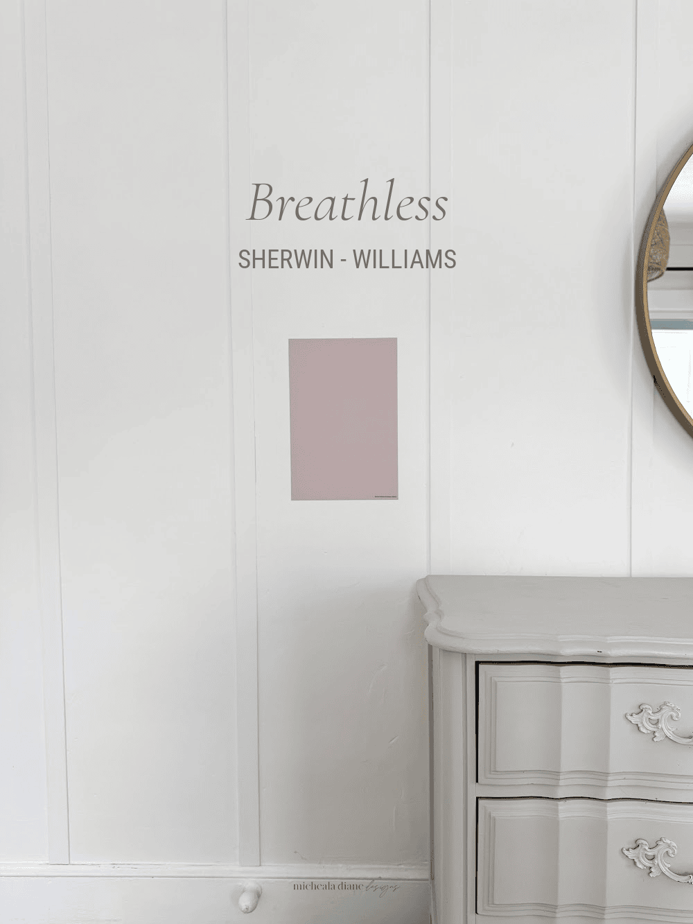
Breathless Sherwin-Williams
Breathless (SW 6022) by Sherwin-Williams is a calming light blush. Its undertones include cool pink with subtle violet and gray influences, giving the hue a softness that can lean slightly dusty or muted depending on light.
With an LRV of 57, it falls within the light range, reflecting plenty of light and helping rooms feel open and bright without becoming stark. In real rooms, Breathless reads as a gentle, airy color that shifts with lighting, appearing more delicate and pastel in bright natural light, and slightly more muted and neutral under softer or artificial lighting.
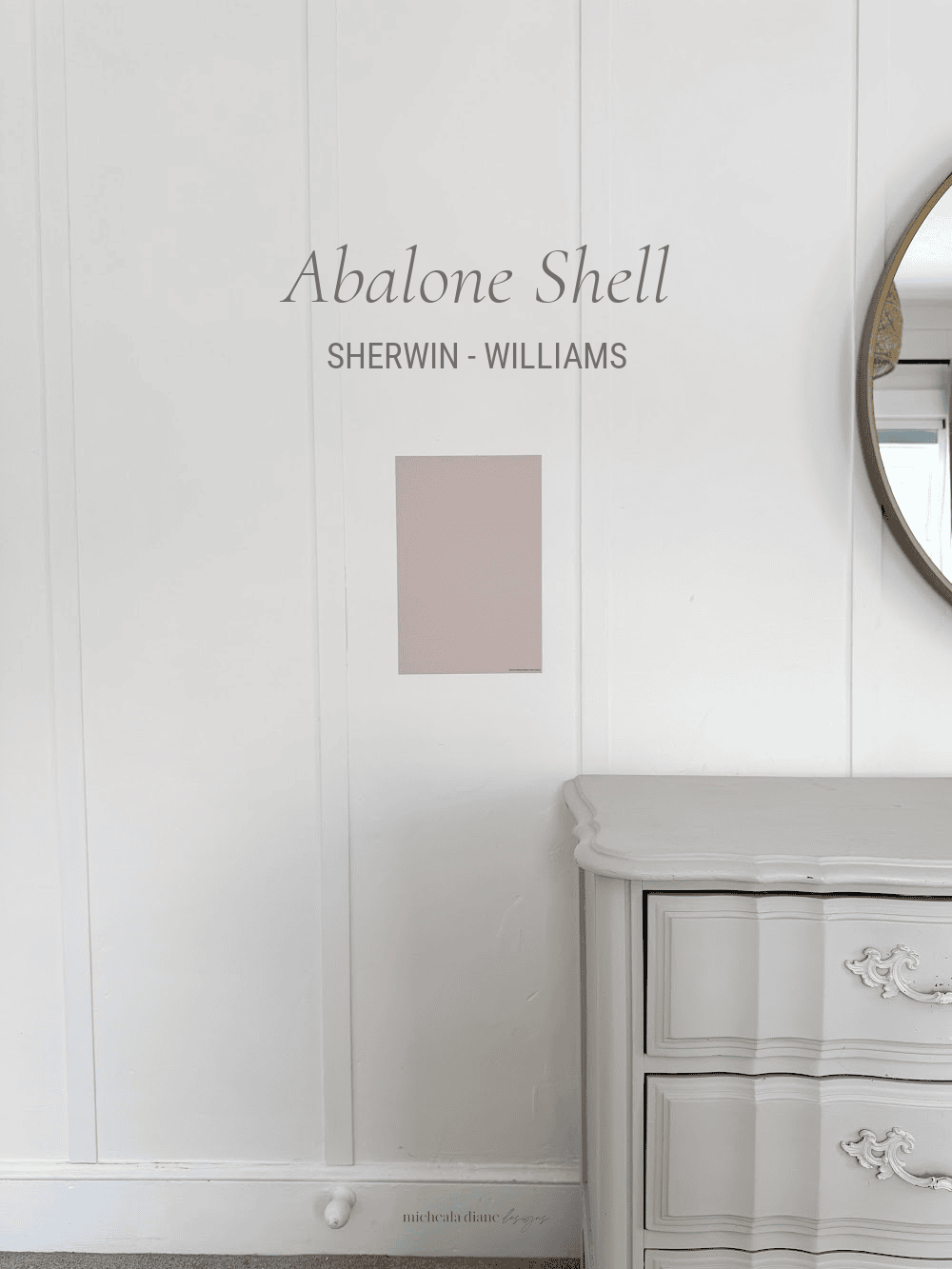
Abalone Sherwin-Williams
Abalone Shell (SW 6050) by Sherwin-Williams is a soft, muted neutral. It reads more like a warm, sandy rose-beige that leans subtle and refined rather than overtly pink. Its undertones combine warm beige with muted pink giving it a quiet warmth and a presence that adapts beautifully in both warm and cool lighting conditions.
With an LRV of 60, it sits comfortably in the medium-light range. Meaning it reflects a good amount of light and keeps spaces feeling bright and gentle without ever feeling stark. In real rooms, Abalone Shell feels cozy and approachable yet sophisticated. In bright natural light, it often reads as a soft sandy tone with a barely-there rosy hint. While in lower or artificial light, it leans slightly warmer, creating an inviting and grounded vibe. If color scares you, this is the perfect neutral blush.
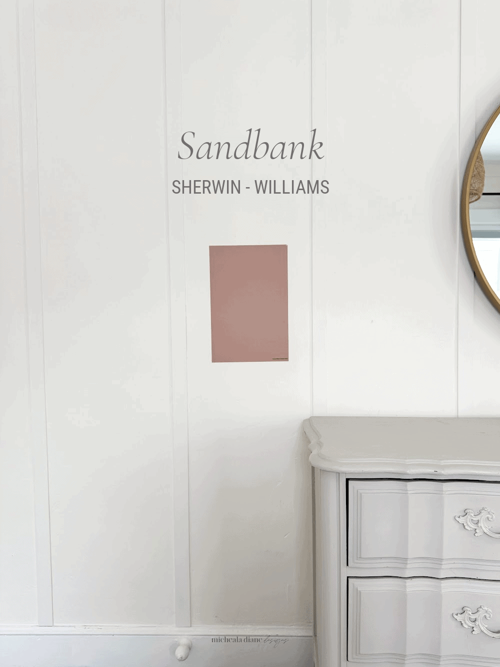
Sandbank Sherwin-Williams
Sandbank (SW 6052) by Sherwin-Williams is a warm, softly muted dusty rose. Its undertones include soft pink, red-violet, and warm beige. Its warmth feels inviting without being overly saturated, making it a versatile choice for spaces that want subtle color with depth.
With an LRV of 40, Sandbank is in the mid-tone range. Meaning the color provides depth without being overly dark or bright. In real rooms, Sandbank typically appears as a muted rosy beige. In brighter natural light, it reads warmer and more peach-toned, while in softer or artificial light, you can really see those red violet undertones. This adaptability makes it a strong choice for bedrooms, living rooms, and areas where you want a neutral that feels cozy yet refined.
What to Read Next:
Neutral Paint Colors | My Home Paint Colors
Want to save this for later? Post this Dusty Pink Paint Colors to your favorite Pinterest Board!