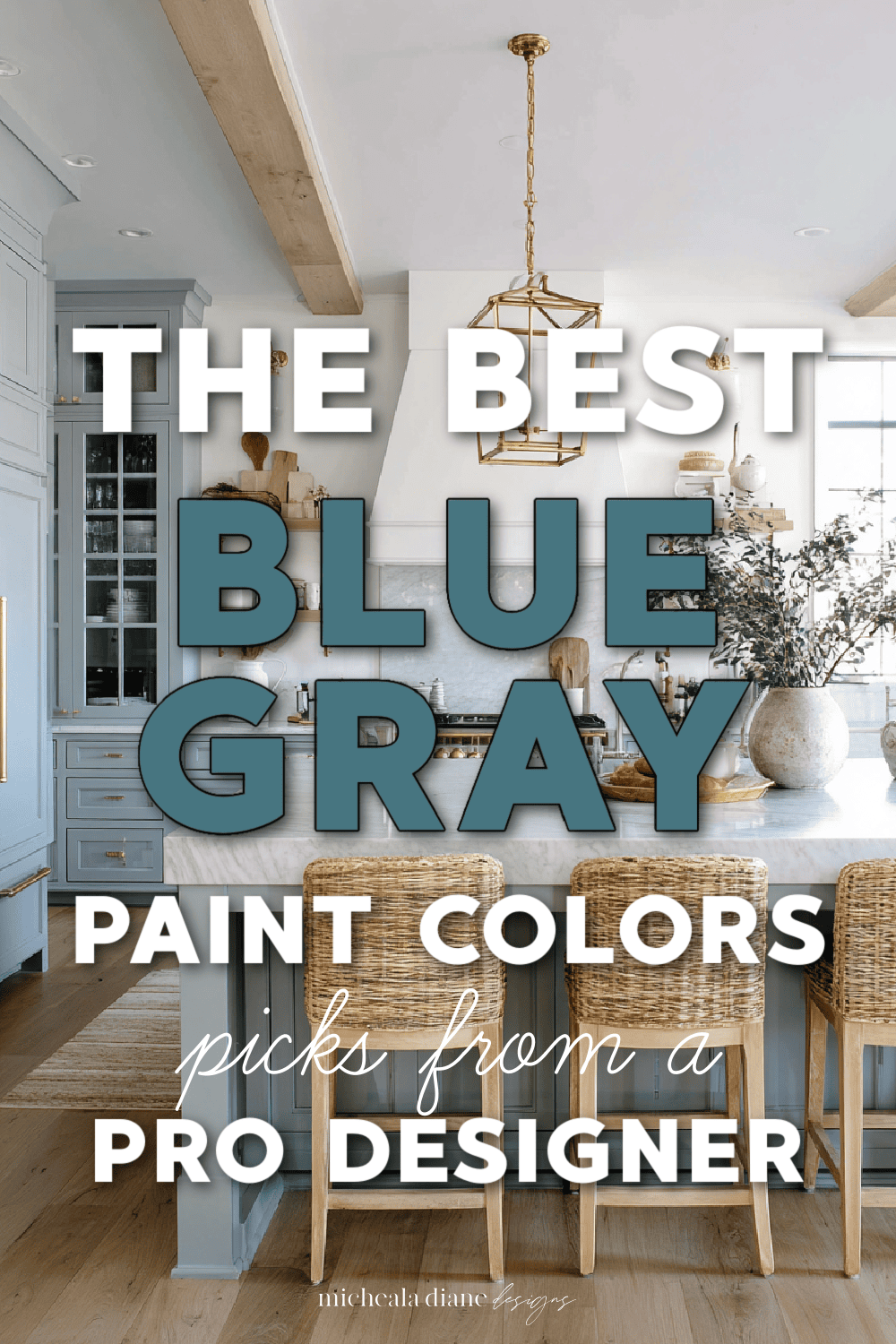
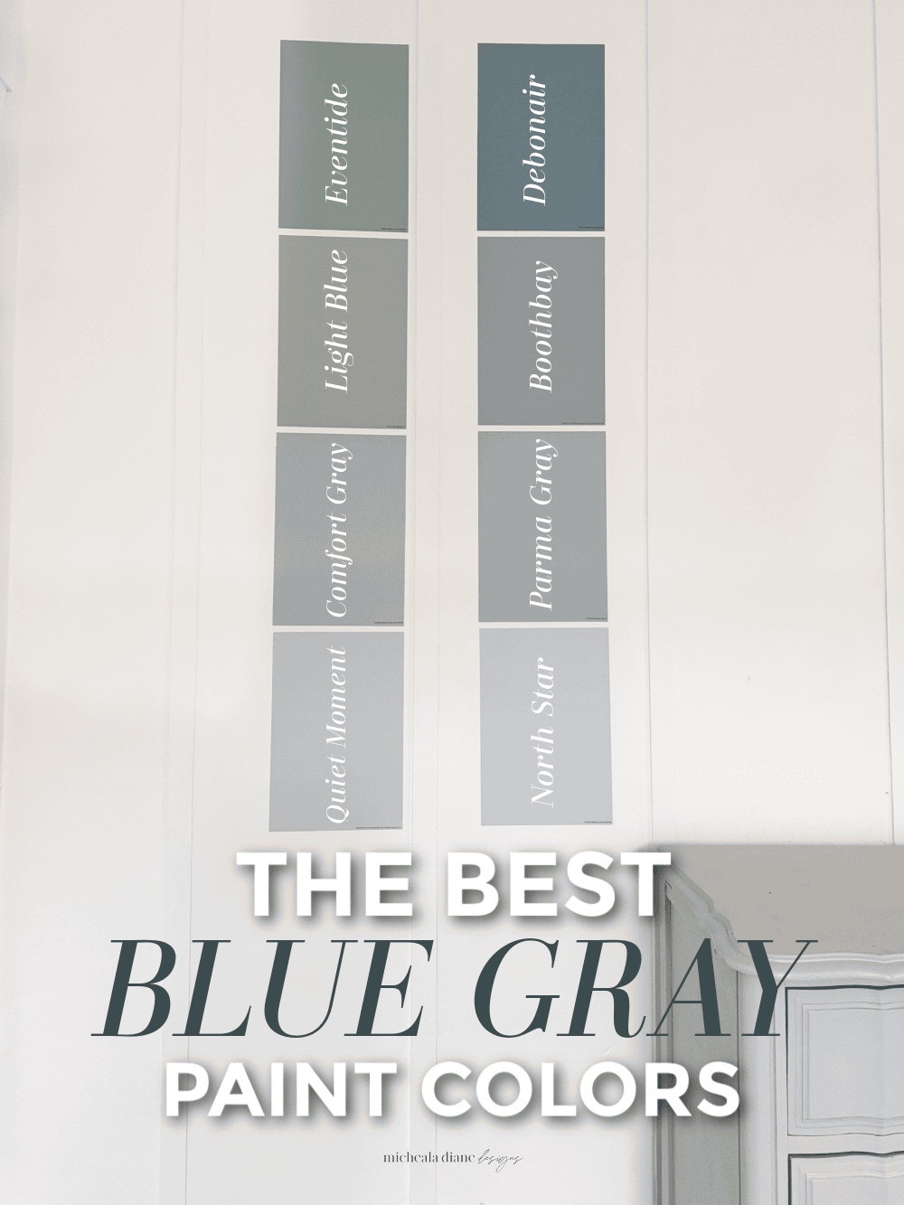
The Best Blue Gray Paint Colors
If you’ve been searching for the perfect neutral with a little more personality, these blue gray paint colors might be exactly what your home has been missing.
What are Blue Gray paint colors?
Blue gray paint colors are exactly what they sound like, a blend of blue and gray. They create a soft, muted, and livable color. Think of them as the perfect middle ground between a true blue (which can sometimes feel bold or playful) and a traditional gray (which can lean flat or cold). Adding blue gives the color life, while the gray tones it down so it feels calm and sophisticated instead of overpowering.
What I love most about blue grays is how versatile they are. Some lean more blue and feel fresh and airy, while others lean more gray and read almost like a neutral with just a hint of color. You’ll also find some with subtle green undertones mixed in, which gives that spa-like, coastal feel.
They work beautifully in just about any room, bedrooms, living rooms, bathrooms, and even cabinetry, because they add interest without making your space feel busy or overwhelming.
Why are Blue Gray paint colors popular?
Blue gray paint colors have become a go-to for so many homes because they strike that perfect balance between staying neutral and adding a little color. Homeowners want something more interesting than plain gray, but not as bold as a true blue, and this is exactly where blue gray paint colors shine.
They’re also incredibly forgiving. The gray undertone helps soften the blue, which means they tend to work well with a wide range of finishes, furniture, and decor styles. Whether your home leans modern, traditional, coastal, or somewhere in between, a good blue gray can usually fit right in.
Another reason they’re so loved is how calming they feel. There’s something about that soft mix of blue and gray that instantly makes a space feel more relaxed and inviting, without trying too hard.
And from a designer perspective, they photograph beautifully, which definitely doesn’t hurt if you’re sharing your space online or just want that polished, pulled-together look.
“ Affiliate links provided for your convenience, please read my disclosure for more information.”
Don’t Paint a Wall Until You Try This…..
As an interior designer, I can’t tell you how many times I’ve seen the wrong paint color completely change a space and not in a good way. Paint looks wildly different depending on lighting, flooring, furniture, and even what direction your windows face. That’s why I always recommend sampling before committing… and Samplize makes that process so easy.
Instead of buying messy sample cans (that you’ll probably never use again), Samplize sends peel-and-stick paint samples made with real paint in the exact color you’re considering. You can move them around your room, test them on different walls, and see how the color shifts from morning to evening. It’s such a game-changer.
I especially love this for my clients and, honestly, for myself when I’m hunting for the perfect shade. It takes the guesswork out and helps you feel confident before you invest time and money in painting an entire room.
If you’re choosing paint, please don’t skip this step. Sampling in your own space is everything. Samplize just makes it simple, clean, and stress-free, which is exactly how decorating should feel.
All the pictures of paint featured in the post are samples from Samplize.
The Best Blue Gray Paint Colors
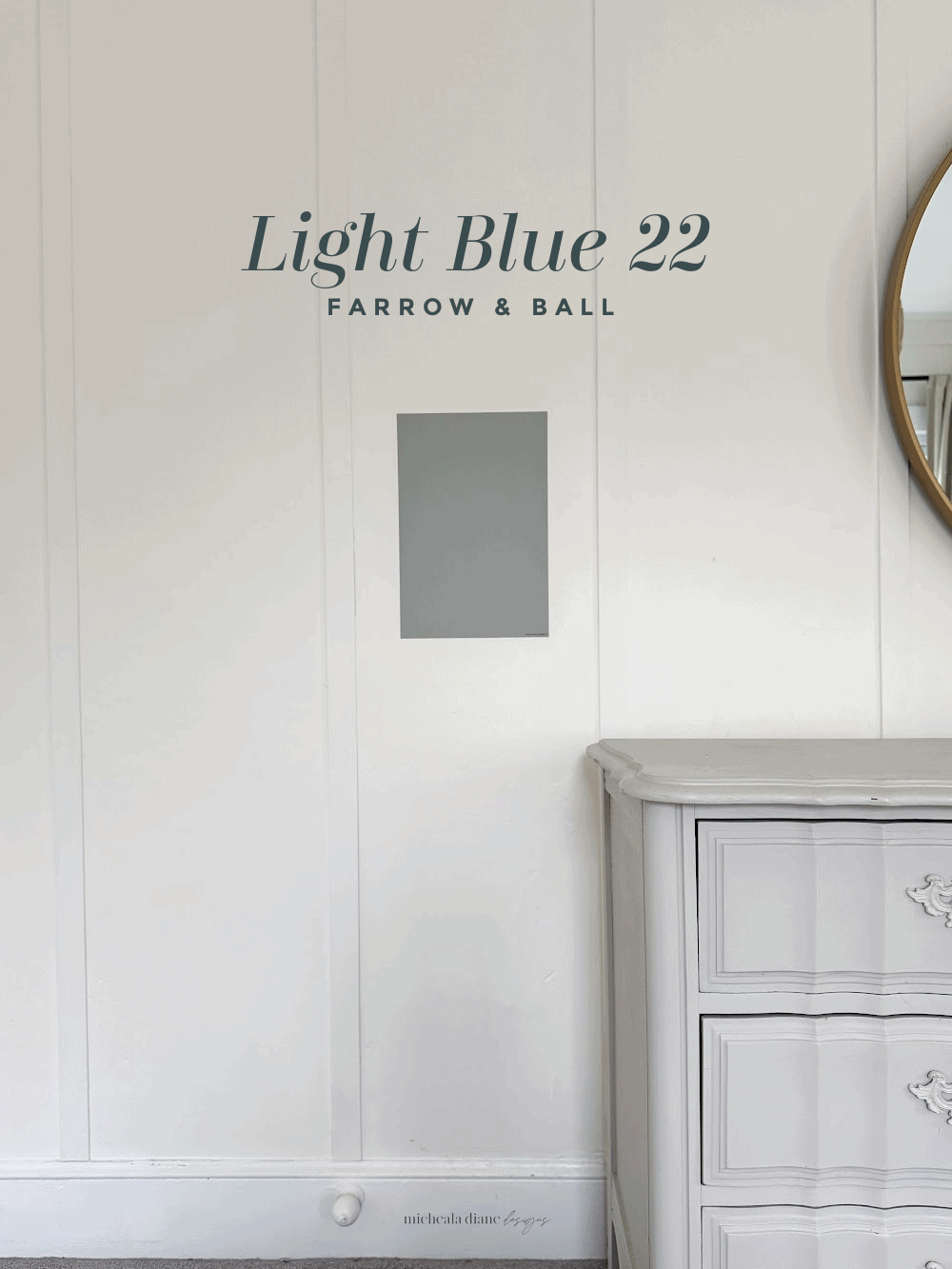
Light Blue Farrow & Ball
Farrow & Ball’s Light Blue No. 22 is one of those chameleon colors that quietly shifts depending on your space. When you see the name light blue, many times you think baby blue, but despite its name, this color leans more toward a soft, silvery blue with noticeable gray undertones.
The light reflectance value (LRV) sits in the mid-range (around the 60s), meaning it reflects a decent amount of light without feeling washed out. Morning light brings out its airy blue side, while evening light enhances the gray, giving it that cozy, muted feel.
Because of that gray base, this is such an easy color to live with. It won’t overwhelm your furniture or compete with decor. It’s especially beautiful in living rooms, bedrooms, or even cabinetry if you want something subtle but still interesting.
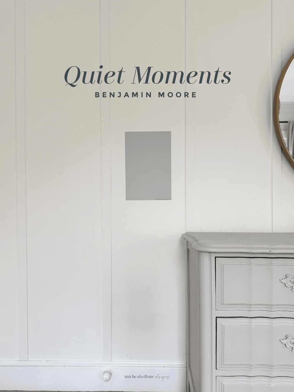
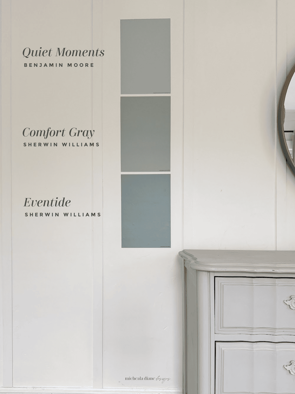
Quiet Moments Benjamin Moore
Quiet Moments 1563 is an easy color to love. It’s a soft blue-green with a gentle gray undertone that keeps it feeling calm, not beachy or overly colorful. What makes this color so special is how it shifts throughout the day. In bright natural light, it leans more blue and feels fresh and airy. As the light softens, the green undertone becomes more noticeable, giving it a relaxed vibe.
The light reflectance value (LRV) sits in the mid-range of 60 and reflects a good amount of light. It works especially well in bathrooms, bedrooms, or anywhere you want a peaceful retreat. Because of its gray base, it also pairs effortlessly with whites, warm woods, and even brass accents. It’s one of those colors that feels like a neutral, but way more interesting.
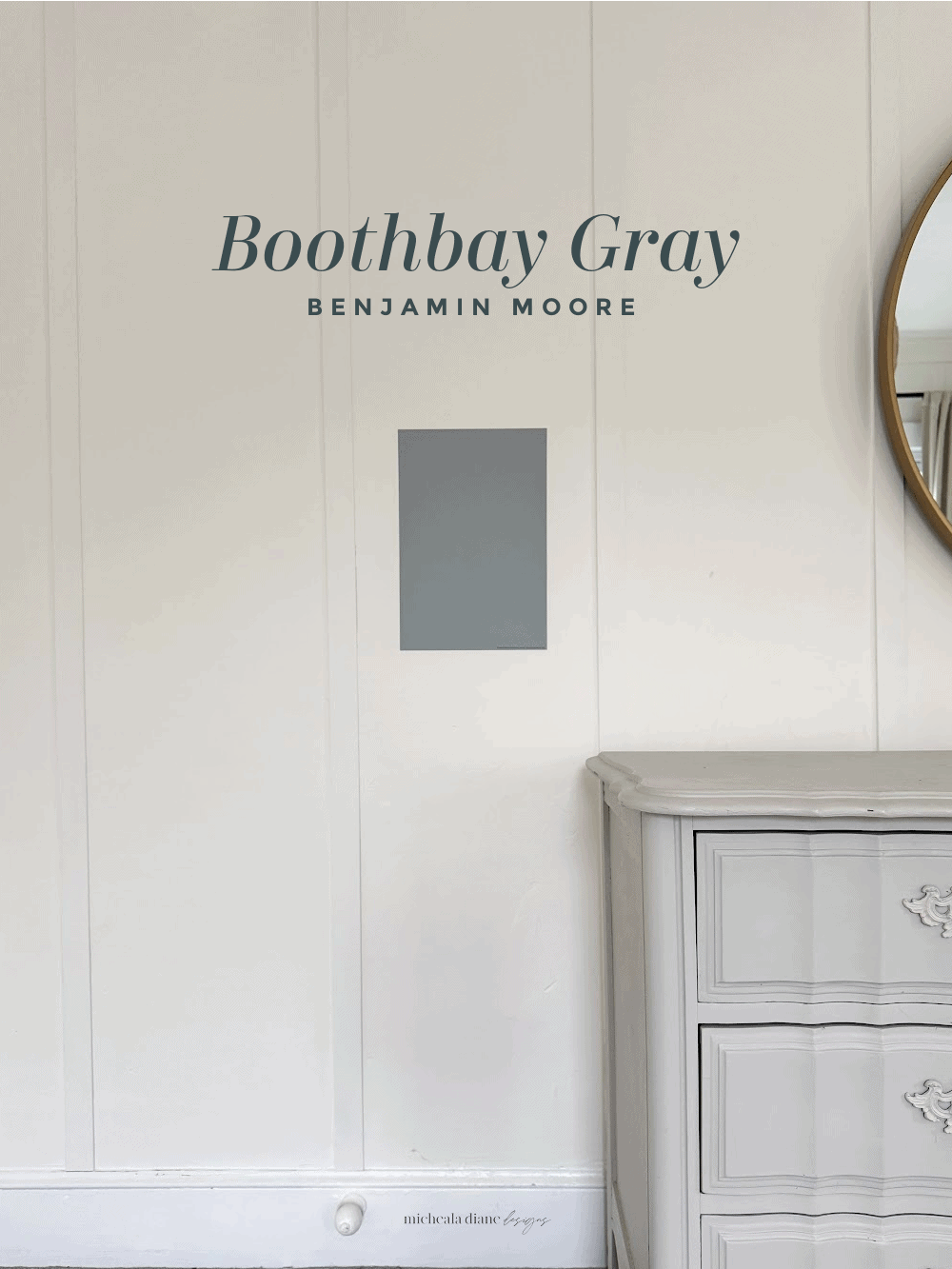
Boothbay Gray Benjamin Moore
Boothbay Gray HC-165 is one of those underrated colors that deserves way more attention, and it’s one I recommend often. It’s a medium-toned blue-gray with a soft, coastal feel, but the gray undertone keeps it sophisticated rather than beachy.
With an LRV around 43, it has a bit more depth than lighter blue-grays, giving it a richer look on the wall. This color really comes alive in rooms with good natural light. In bright spaces, you’ll notice more of the blue comes through, while in dimmer rooms, it leans more gray and can feel moodier.
It’s a great option if you want color without going too bold. It is perfect for living rooms, bedrooms, or even exteriors. It pairs beautifully with crisp whites, black accents, and natural wood tones. If you’re looking for a blue-gray that feels grounded and classic, this one is a favorite.
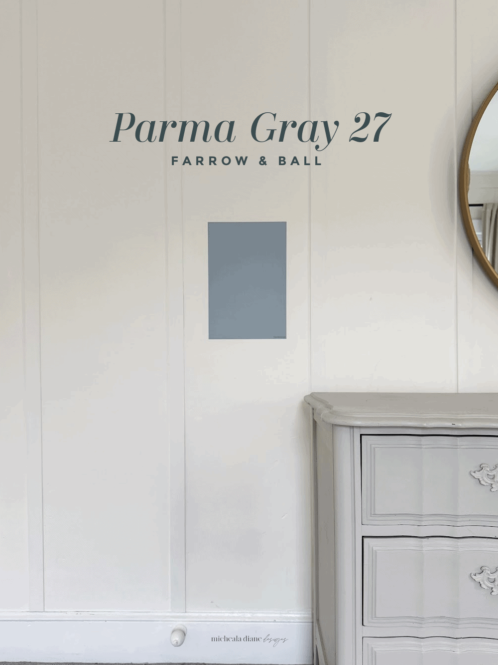
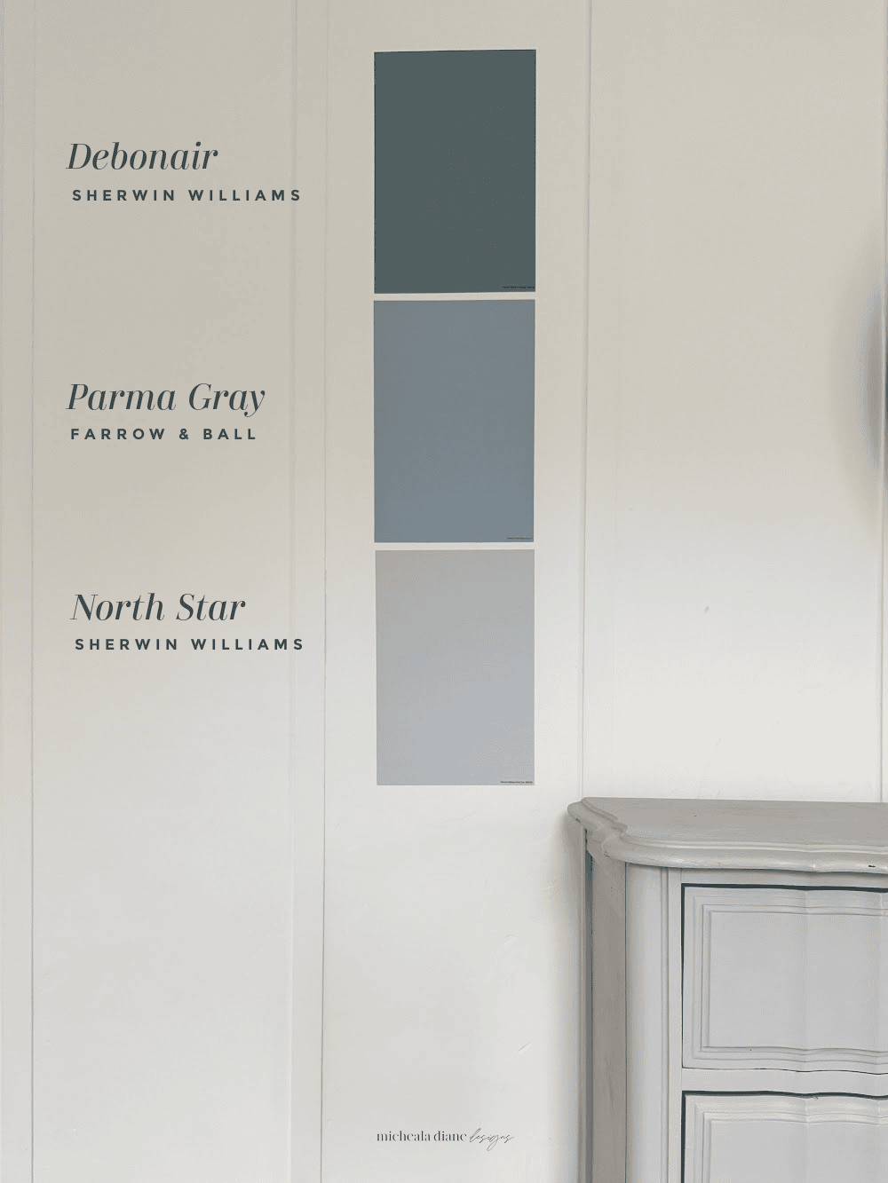
Parma Gray Farrow & Ball
Parma Gray No 27 is a classic, slightly more traditional blue-gray that feels polished and timeless. It leans more blue than many gray-blues, but still has enough gray in the base to keep it soft and livable.
With an LRV around 51, it sits comfortably in the mid-range, reflecting light while still giving you that cozy vibe. In bright daylight, Parma Gray feels fresh and refined, almost like a soft heritage blue. As the light fades, the gray undertone becomes more prominent, giving it a more muted, sophisticated look.
This is a beautiful choice for dining rooms, offices, or entryways where you want something elevated but not overpowering. It pairs especially well with deeper blues, warm whites, and antique brass finishes.
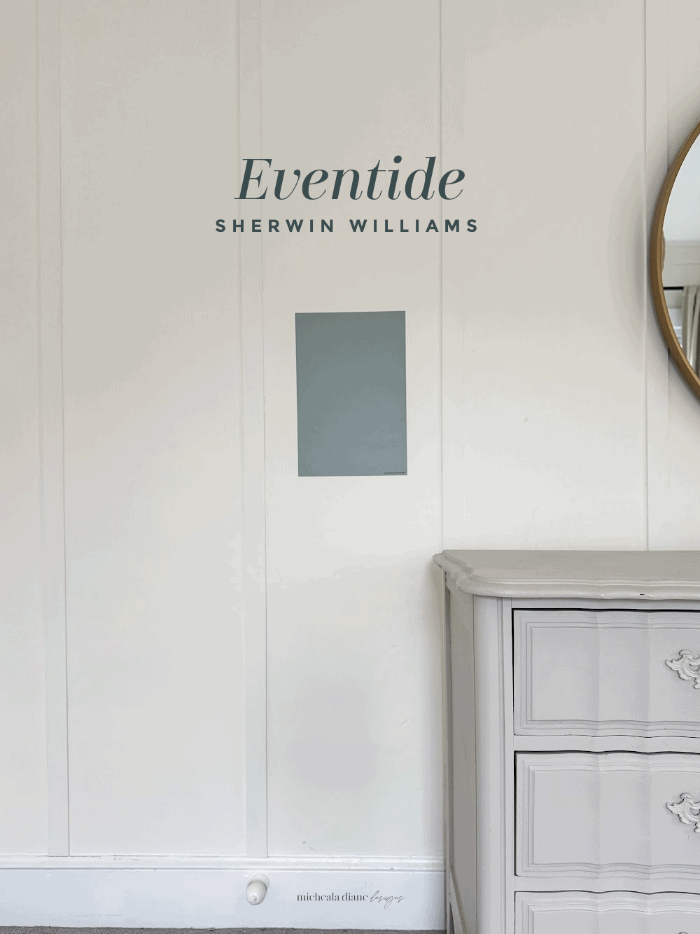
Eventide Sherwin-Williams
Eventide SW9643 is one of those deeper blue-grays that instantly adds mood and depth to a space. It leans more toward the gray side with cool blue/ green undertones, making it feel grounded and sophisticated.
The LRV sits in the mid-to-lower range of 41, so it absorbs more light and creates a cozy feel. In bright rooms, Eventide softens and shows more of its blue side. In lower light or north-facing spaces, it deepens into a rich, moody gray-blue.
This color works beautifully in bedrooms, offices, or accent walls where you want a bit of drama without going too dark. Pair it with warm woods, soft textiles, and creamy whites to balance the coolness.
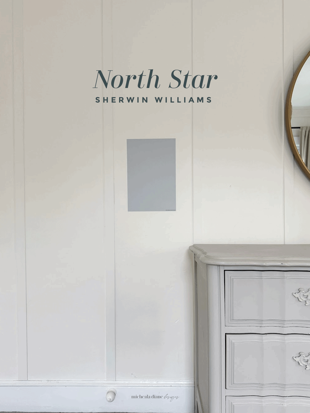
North Star Sherwin-Williams
North Star SW6246 is a light, airy blue-gray that feels clean, fresh, and neutral. It leans slightly more blue than gray, but the gray undertone keeps it from feeling too bright or childish.
With an LRV of 62, it reflects a lot of light, making it a great choice for smaller or darker spaces. In natural daylight, North Star reads as a soft, calming blue. As the light shifts, especially in the evening, the gray undertone becomes more noticeable, toning it down into a subtle neutral.
It’s perfect for bedrooms, nurseries, or bathrooms where you want a light and relaxing feel. This color pairs effortlessly with crisp white trim, light woods, and soft textiles. It’s one of those “safe but still pretty” colors that works in almost any room.
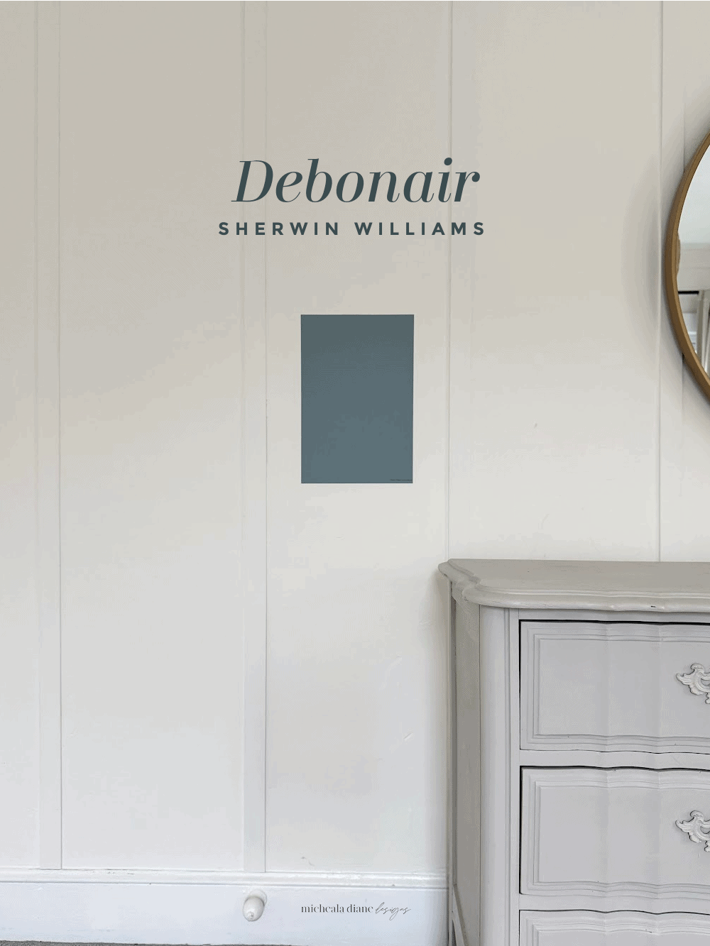
Debonair Sherwin-Williams
Debonair SW9139 is a rich, mid-to-dark blue with a strong gray undertone that gives it a refined, tailored feel.
With an LRV around 34, it’s definitely on the deeper side, which means it adds depth and contrast to a space rather than reflecting a lot of light. In well-lit rooms, Debonair shows off its blue side and feels bold. In lower light, it deepens into a moody blue-gray that feels dramatic and cozy.
This is a beautiful choice for accent walls, dining rooms, or cabinetry if you want something with presence. It pairs especially well with warm metallics, crisp whites, and natural wood tones. If you’re craving a color that feels designer and elevated without going navy, Debonair is a standout.
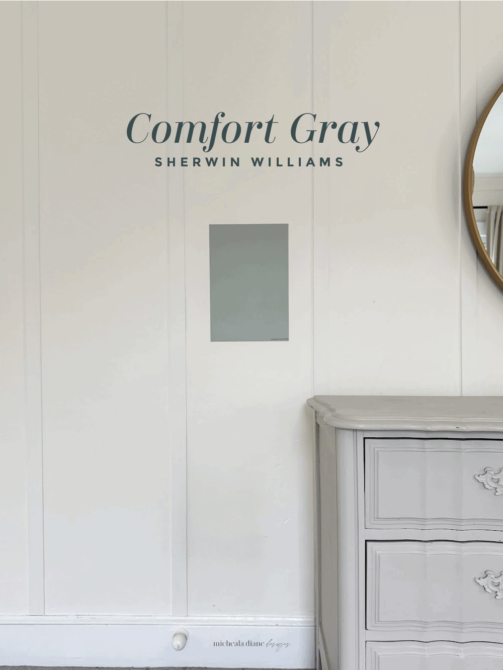
Comfort Gray Sherwin-Williams
Comfort Gray SW6205 is that perfect blue-gray that designers love. Despite the name, it actually leans more blue-green with a noticeable gray undertone that softens the color and keeps it from feeling too coastal.
With an LRV around 54, it sits right in that sweet spot of not being too dark, not too light. Comfort Gray is an ideal color for adding subtle contrast to a room. In bright natural light, you’ll see more of the blue come through, while in lower light it leans deeper and slightly more muted.
It’s a beautiful choice for bedrooms, bathrooms, offices, or even kitchen cabinetry if you want something grounded but still soft. Pair it with creamy whites and warm textures to keep it from feeling too cool.
What to Read Next:
Neutral Paint Colors | My Home Paint Colors
Want to save this for later? Post this Best Blue Gray Paint Colors to your favorite Pinterest Board!